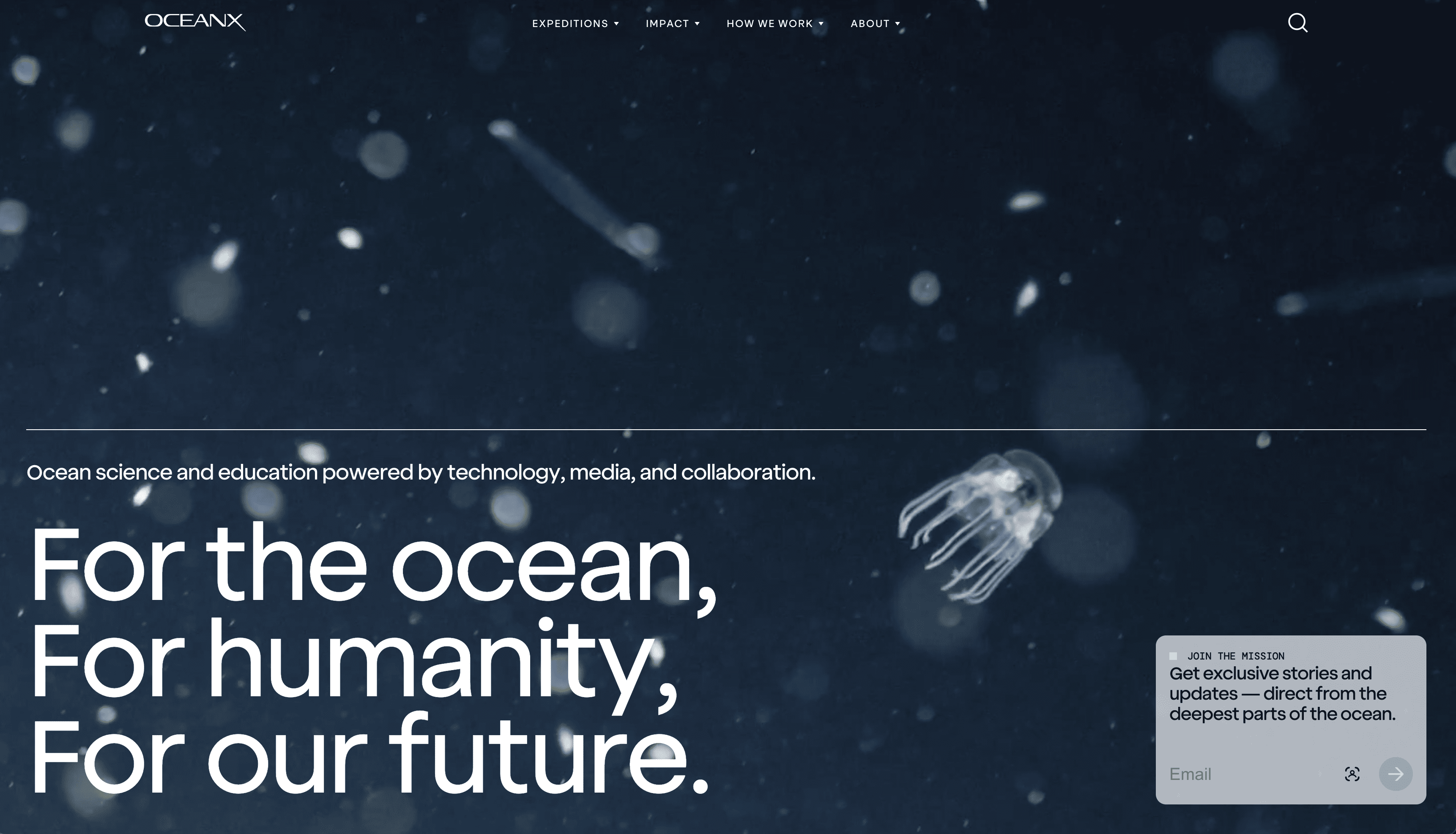
Design

Brand, product, and
the system between them.

Headify treats design as a first-class practice, not a finishing layer. Senior brand, product, and systems designers work alongside engineering and strategy from the first sprint — covering brand identity, UX research, UI and product design, motion, and the design systems that make all of it scale.

Brand identity and visual design exploration
01Brand

Brand & visual identity.

Brand assets your marketing team will defend, built as a system rather than a one-off logo file.

Senior brand designers shaping logo and wordmark systems, typography and color systems, visual language, voice and tone, and the brand guidelines that keep every application — digital and print — on the same page. We work in Figma, FigJam, and Adobe Creative Suite, and we leave behind the artifacts your team can extend without us.

What we deliver

  • Logo and wordmark systems
  • Typography and color systems
  • Brand guidelines and visual language
  • Voice, tone, and editorial direction
  • Brand applications across digital and print
  • Marketing collateral and presentation systems

Outcomes we drive

  • Brand assets your marketing team will defend
  • Decks and collateral that look like the company you're trying to be.
  • A visual system that survives the next campaign
UX research session with journey maps on the wall
02UX Research

UX research & strategy.

The strategic work that decides whether a product gets used or quietly abandoned.

User research interviews, journey mapping, information architecture, IA audits, content strategy, and the usability testing that turns assumptions into evidence. We bring research methods that fit the question, and we hand back findings product teams can act on — not a 60-page deck nobody reads.

What we deliver

  • User research and interviews
  • Journey mapping and service blueprints
  • Information architecture and IA audits
  • Usability testing and research synthesis
  • Content strategy and editorial planning
  • Stakeholder workshops and discovery

Outcomes we drive

  • Interfaces your users actually finish a task in
  • Roadmaps grounded in evidence, not opinion
  • Honest reads on what's working and what isn't
Product designer reviewing UI mockups on screen
03Product Design

UI & product design.

Interface design that holds up across the second screen, the second platform, and the second product team.

Senior product designers working in Figma on interaction patterns, responsive layouts, accessibility (WCAG), prototyping, and the design ops that keep velocity honest. We design for the build, not the dribbble shot, and we partner with engineering from the first wireframe.

What we deliver

  • Interface design in Figma and Sketch
  • Interaction patterns and component design
  • Responsive and adaptive layouts
  • Accessibility (WCAG 2.2 AA)
  • Prototyping and design validation
  • Design ops and handoff workflows

Outcomes we drive

  • Interfaces your users actually finish a task in
  • Design that survives contact with engineering
  • Accessibility your auditors can defend
Designers collaborating on motion prototypes
04Motion

Motion & interaction design.

Motion that earns its weight: feedback the eye trusts, transitions that make state changes legible, brand moments that travel.

Micro-interactions, transitions, and prototyping in Rive, Lottie, and Framer Motion. Animated brand assets, video, and the production-ready motion specs that engineering can implement on the first pass. We use motion to clarify, not to decorate.

What we deliver

  • Micro-interactions and feedback patterns
  • Page and state transitions
  • Prototyping with Rive, Lottie, Framer Motion
  • Animated brand assets and logo motion
  • Video and motion graphics for marketing
  • Production-ready motion specs

Outcomes we drive

  • Interfaces your users actually finish a task in
  • Brand moments that translate across channels
  • Motion specs engineering can ship on the first pass
Color swatches and design system components
05Design Systems

Design systems.

A design system that survives the second product team picking it up.

Design tokens, component libraries, and the Storybook and Zeroheight documentation that makes a system usable beyond its original authors. We bring governance models, contribution workflows, and the cross-product alignment that turns a kit of parts into a real platform.

What we deliver

  • Design tokens and themable foundations
  • Component libraries in Figma and code
  • Storybook and Zeroheight documentation
  • Governance and contribution models
  • Multi-product and multi-brand systems
  • Design-to-code workflows and audits

Outcomes we drive

  • A design system that survives the second product team picking it up
  • Consistency without slowing teams down
  • A platform your design and engineering org will defend
Selected Work

Brand, product, and the system underneath.

A view of recent enterprise engagements — brand systems, product redesigns, and design systems shipped alongside teams at OceanX, Shift5, Defiant, Terminal Industries, Composites, and ON Energy. Every one delivered next to engineering, in production, against a real release date.

Engage with us

Bring us the brand brief.

A scrappy MVP that needs a brand. A design system stuck halfway. Marketing collateral that doesn't look like the company you're trying to be. We'd like to scope it honestly.